Project
Logo, Website Design and other projects for Combined Cloud Accounting
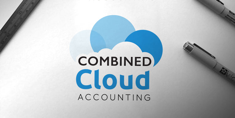
I was asked to create a new logo for a local accounting company that was starting up. Their brief was to create a logo that reflected their company name so I created some options based on the cloud design. They also needed a website that also reflected the branding we worked together on.
Logo design for Combined Cloud Accounting
I presented a few ideas to the client and they loved the idea of the combined blue circles that shaped the cloud symbol. Using bold text that also is shaped by the cloud icon.

The brand colours The main colours are the shades of blue and black

Imagery should be full colour images with blue borders in the colour scheme.

Elements include the cloud icon and cloud shape. click here

Combined Cloud Accounting needed a one website with contact info.
Website
The website was a single page website set up to keep to the above branding styles so fonts and colours and the imagery thoughout the site were in line with the style. The site was designed in html with all major changes being done by Harper Design Studio, with Nicky Harper being the Web Designer and Manager.
Visit the site at www.combinedcloud.co.uk

Other Projects

Cards
Business Cards

Folded Leaflet
Square Folded Leaflet

Roller Banner
Pull up Roller Banner